Applications we design are becoming increasingly data-driven. The need for quality data visualization is as high as ever. Confusing and misleading graphics are all around us, but we can change this by following these simple rules.
我们设计的应用程序正变得越来越由数据驱动。对高质量的数据可视化的需求一如既往的高。令人困惑和误导的图表设计就在我们身边,但我们可以通过遵循这些简单的规则来改变这种情况。
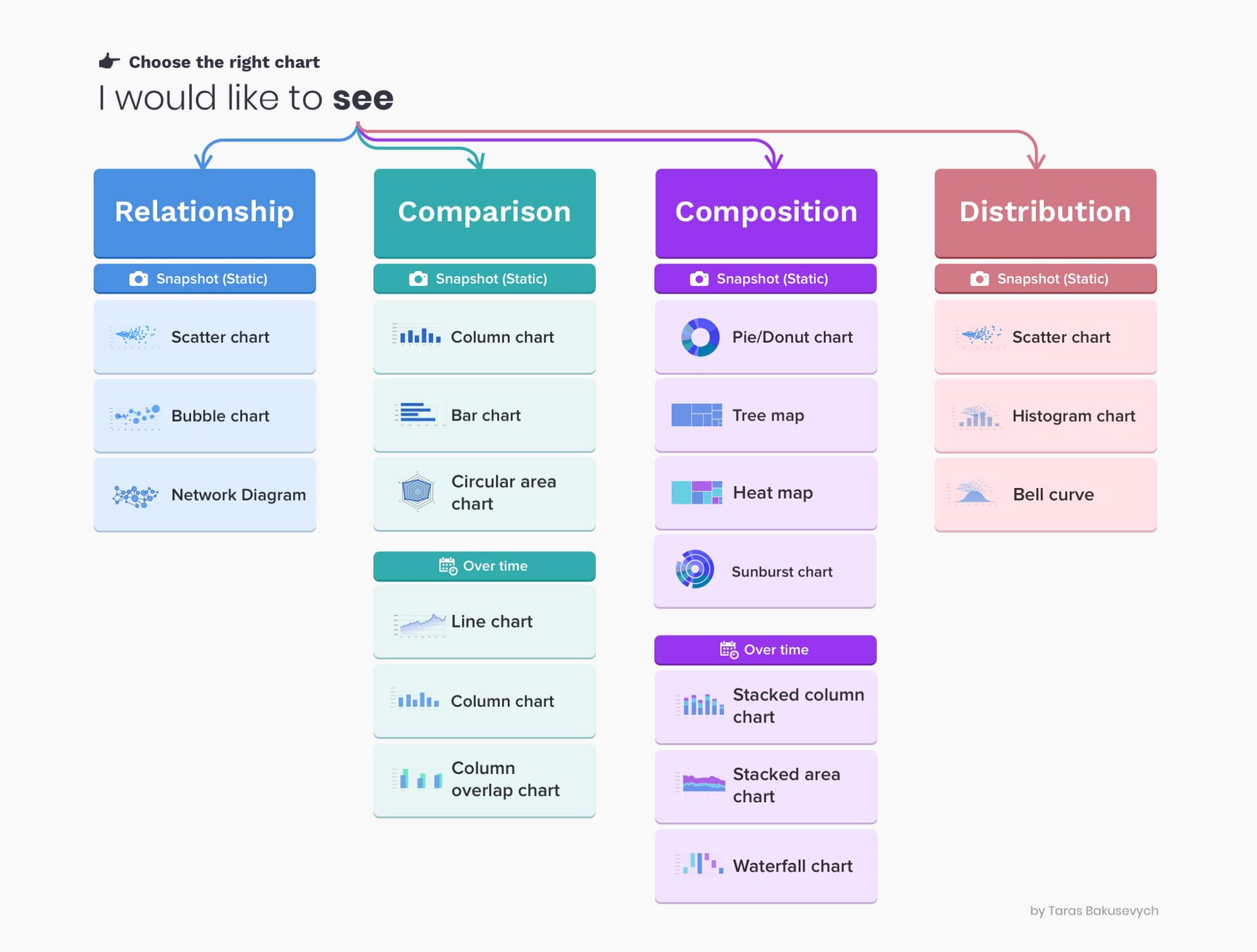
1. 选择正确的图表类型(Choose the right chart type)
Choosing the wrong chart type, or defaulting to the most common type of data visualization could confuse users or lead to data misinterpretation. The same data set can be represented in many ways, depending on what users would like to see. Always start with a review of your data set and user interview.
选择错误的图表类型,或默认为最常见的数据可视化类型,可能会使用户感到困惑或导致数据的误解。同样的数据集可以用很多方式表示,这取决于用户想看到什么。总是从审查你的数据集和用户访谈开始。
You can learn more on how to pick the right representation for your data, and how to design effective dashboards in my article about Dashboard design.
你可以在我关于仪表盘设计的文章中了解更多关于如何为你的数据挑选正确的表现形式,以及如何设计有效的仪表盘。
2. 基于正负值,使用正确的绘图方向(Use correct plotting directions based on the positive and negative values)
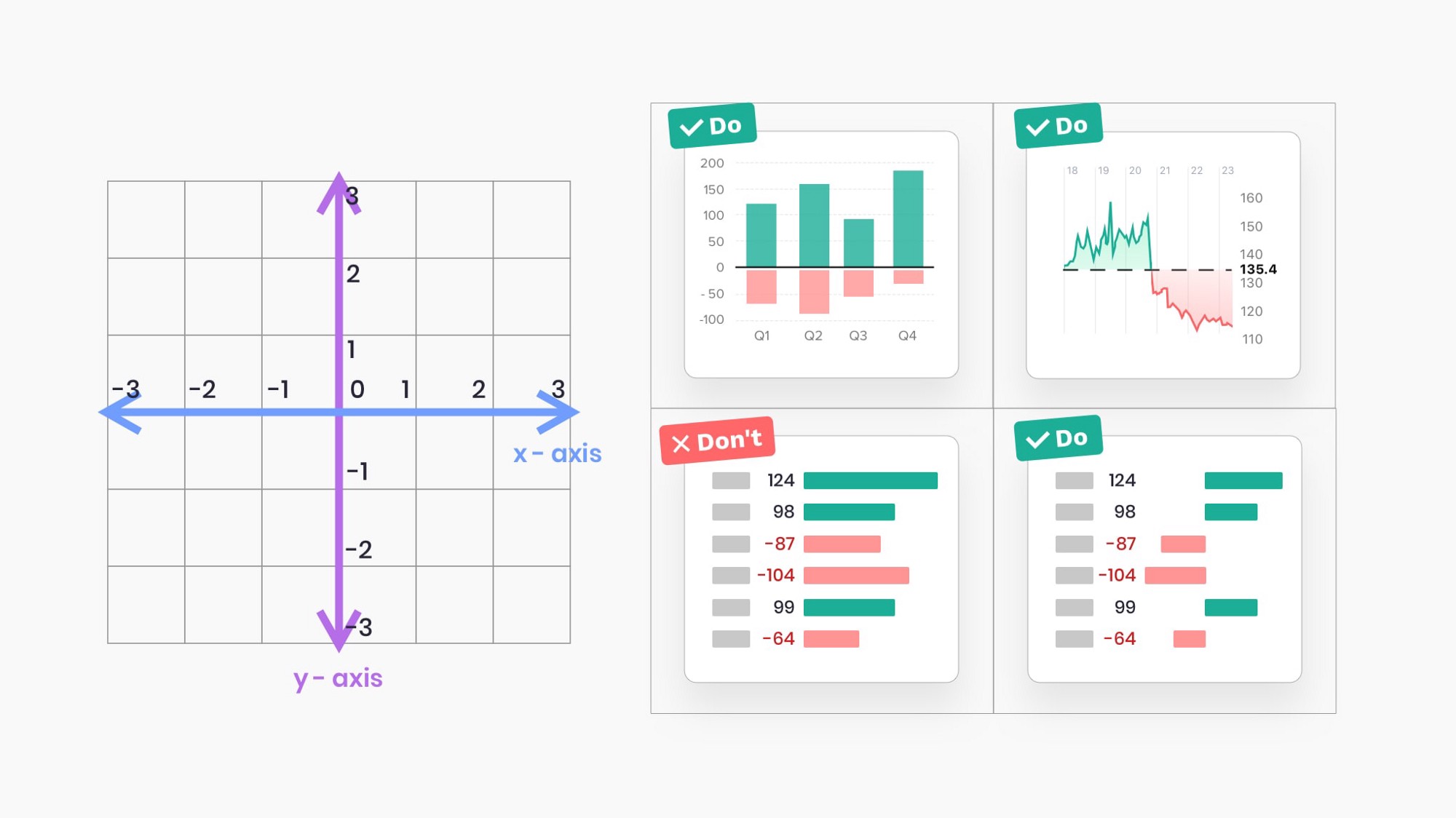
When using horizontal bars, plot negatives values on the left side and positive on the right side of a baseline.
Do not plot negative and positive values on the same side of the baseline.
当使用水平条时,将负值绘制在基线的左边,正值绘制在基线的右边。不要在基线的同一侧绘制负值和正值。
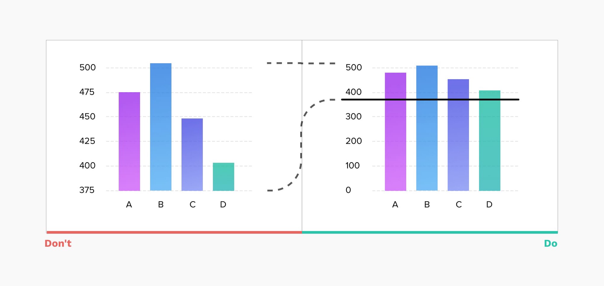
3. 柱状图总是从0基线开始(Always start a bar chart at 0 baseline)
Truncation leads to misrepresentation. On the example below, looking at the chart on the left, you can quickly conclude that value B is more than 3 times greater than D when in reality the difference is far more marginal. Starting at zero baseline ensures that users get a much more accurate representation of data.
截断会导致错误的表述。在下面的例子中,看左边的图表,你可以很快得出结论,B值是D值的3倍多,而实际上,差异要小得多。从零基线开始确保用户得到更准确的数据表示。
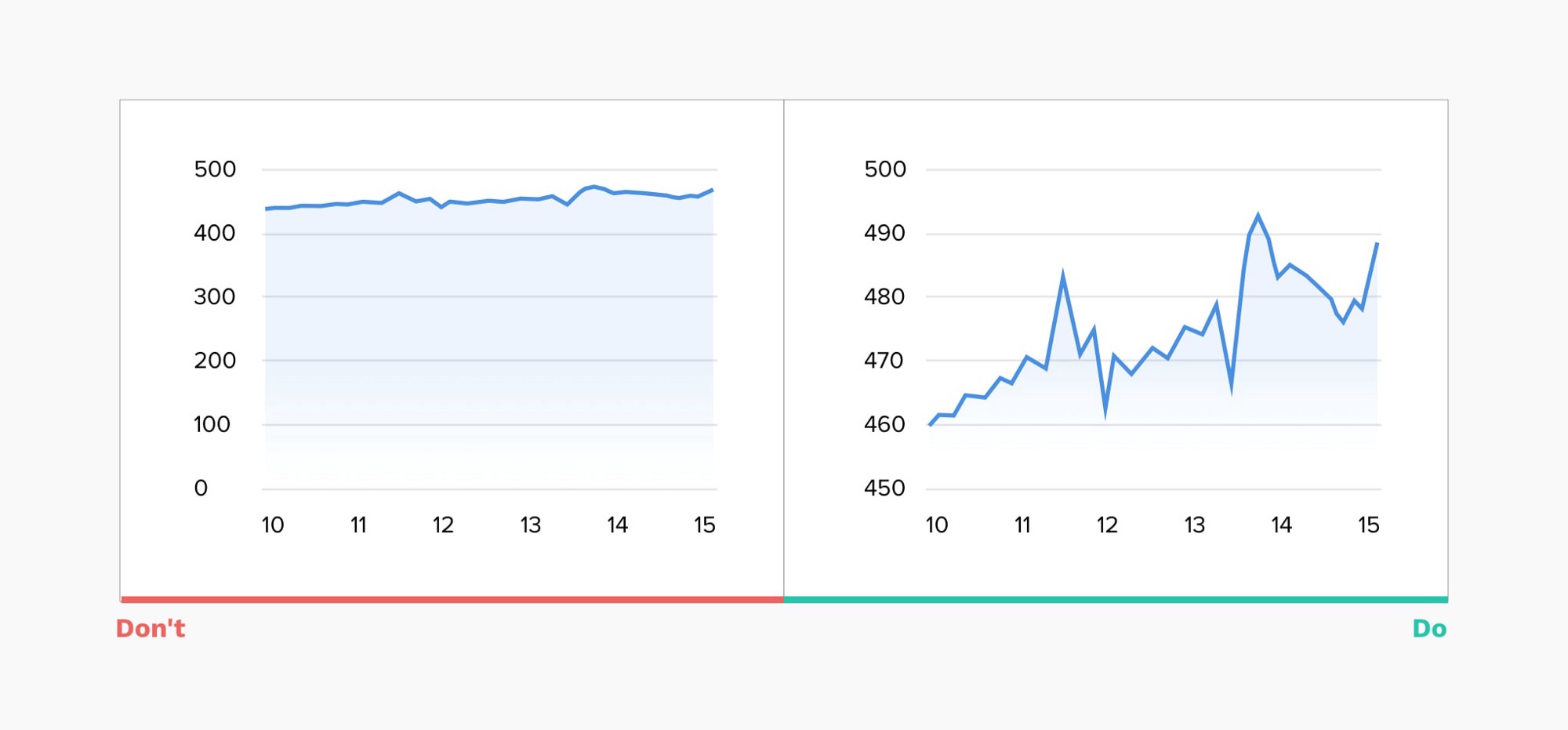
4. 对折线图使用自适应的Y轴刻度(Use adaptive y-axis scale for line charts)
For line charts always limiting the y-axis scale to start at zero may render the chart almost flat. As the main goal for a line chart is to represent the trend, it’s important to adapt the scale based on the data set for a given period and keep the line occupying two-thirds of the y-axis range.
对于折线图来说,总是将Y轴的刻度限制在0开始,可能会使图表变得几乎平坦。由于折线图的主要目标是表示趋势,因此根据特定时期的数据集来调整比例,并保持折线占据y轴范围的2/3是很重要的。
5. 使用折线图时要考虑到你的时间序列(Consider your time series when using a line chart)
The line chart is composed of “markers” that are connected by lines, often used to visualize a trend in data over intervals of time — a time series. This helps to illustrate how values change over time and works really well with short time intervals, but when data updates infrequently this may cause confusion.
折线图是由线条连接的 “标记 “组成的,通常用于可视化数据在时间间隔内的趋势–时间序列。这有助于说明数值是如何随时间变化的,在时间间隔较短的情况下效果非常好,但当数据更新不频繁时,这可能会引起混淆。
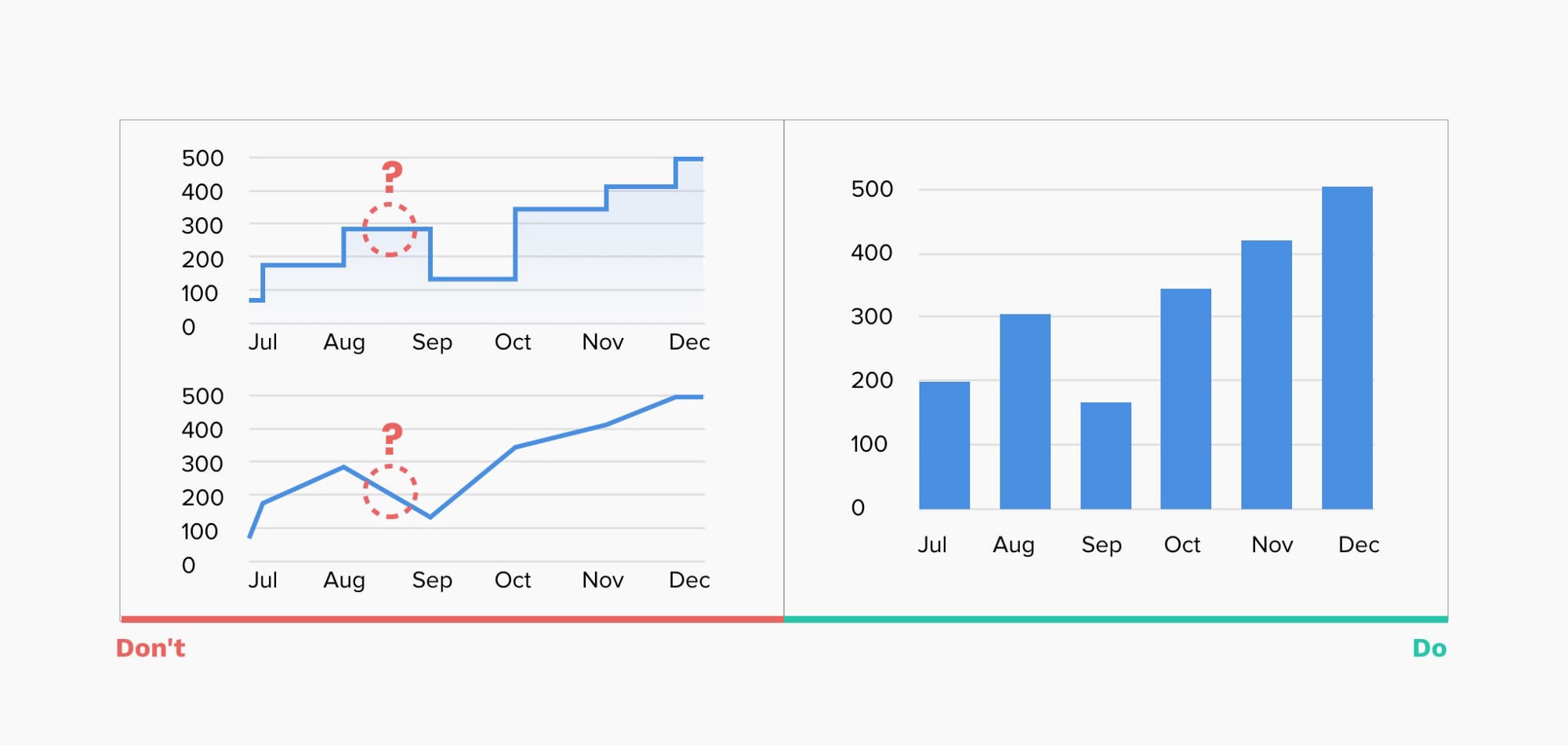
Ex. Using a line chart to represent yearly revenue, if values are updated monthly will open the chart to interpretation. Users may assume the lines connecting the “markers” are representing actual values when in reality true revenue numbers at that specific time are unknown.
In such scenarios using a vertical bar chart can be a better option.
例如,使用折线图来表示每年的收入,如果数值是每月更新的,那么图表就会被解释。用户可能会认为连接 “标记 “的线代表了实际的价值,而实际上在那个特定时间真正的收入数字是未知的。
在这种情况下,使用垂直条形图可能是一个更好的选择。
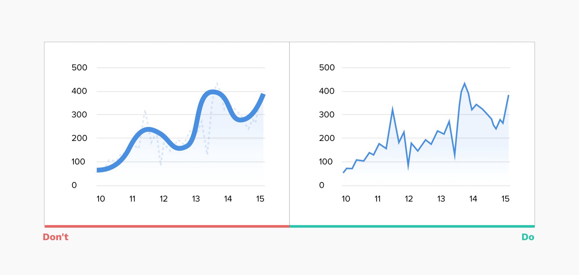
6. 不要使用 “平滑的 “折线图(Do not use “smoothed” line charts)
Smoothed line charts may be visually pleasing but they misrepresent the actual data behind them, also excessively thick lines obscure the real “markers” positions.
平滑的线形图可能在视觉上令人愉悦,但它们歪曲了其背后的实际数据,而且过粗的线条也掩盖了真正的 “标记 “位置。
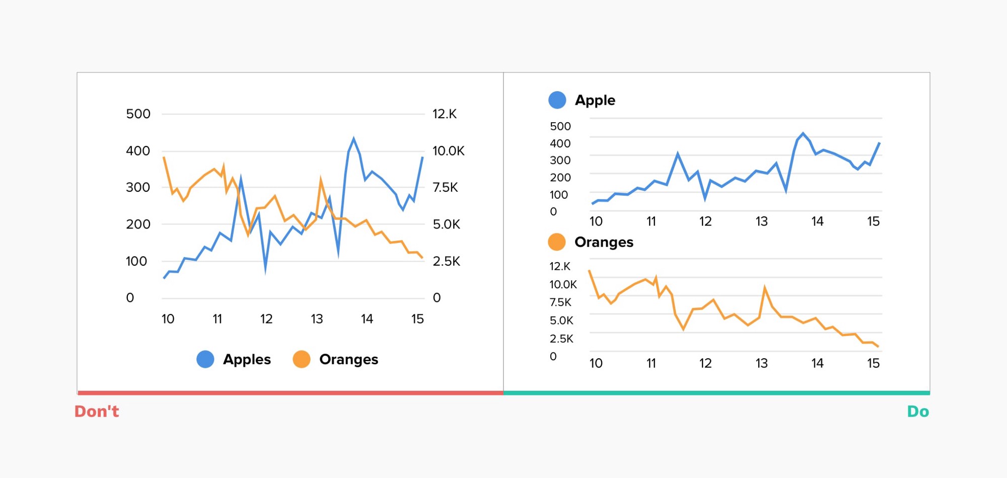
7. 避免混乱的双轴图(Avoid confusing dual-axis)
Often, to save space for your visualization, you may be inclined to use dual-axis charts when there are two data series with the same measure, but different magnitudes. Not only are those charts hard to read, but they also represent a comparison between 2 data series in completely misleading way. Most users will not pay close attention to the scales and just scan the chart, drawing wrong conclusions.
通常情况下,为了节省页面空间,当有两个数据序列具有相同的度量,但幅度不同时,你可能倾向于使用双轴图表。这些图表不仅难以阅读,而且还以完全误导的方式表示两个数据系列之间的比较。大多数用户不会密切注意标度,而只是扫描图表,得出错误的结论。
8. 限制饼状图中显示的切片数量(Limit the number of slices displayed in a pie chart)
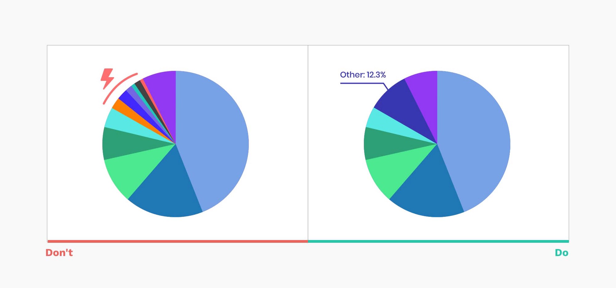
A pie chart is one of the most popular and often misused charts. In most cases, a bar chart is a much better option. But if you decided on a pie chart here are a few recommendations on how to make it work:
- Don’t include more than 5–7 slices, keep it simple
- You can group the extra smallest segments into the “Other” slice
饼图是最受欢迎的图表之一,也是经常被滥用的图表。在大多数情况下,柱状图是一个更好的选择。但是,如果你决定使用饼图,这里有一些关于如何使它发挥作用的建议:
- 不要包括5-7个以上的片断,保持简单
- 你可以将额外的最小的部分归入 “其他 “片中
9. 直接在图表上标注( Label directly on the chart)
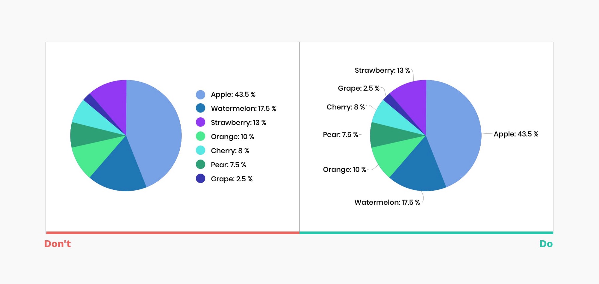
Without proper labeling, no matter how nice is your graph — it won’t make sense. Labeling directly on the chart is super helpful for all viewers. Consulting the legend requires time and mental energy to link the values and corresponding segments.
如果没有合适的标注,无论你的图表有多好看–它都不会有意义。直接在图表上标注对所有的观众都是非常有帮助的。理解图例需要时间和脑力来连接数值和相应的分段。
10. 不要在图表分片上标注(Don’t label on top of slices)
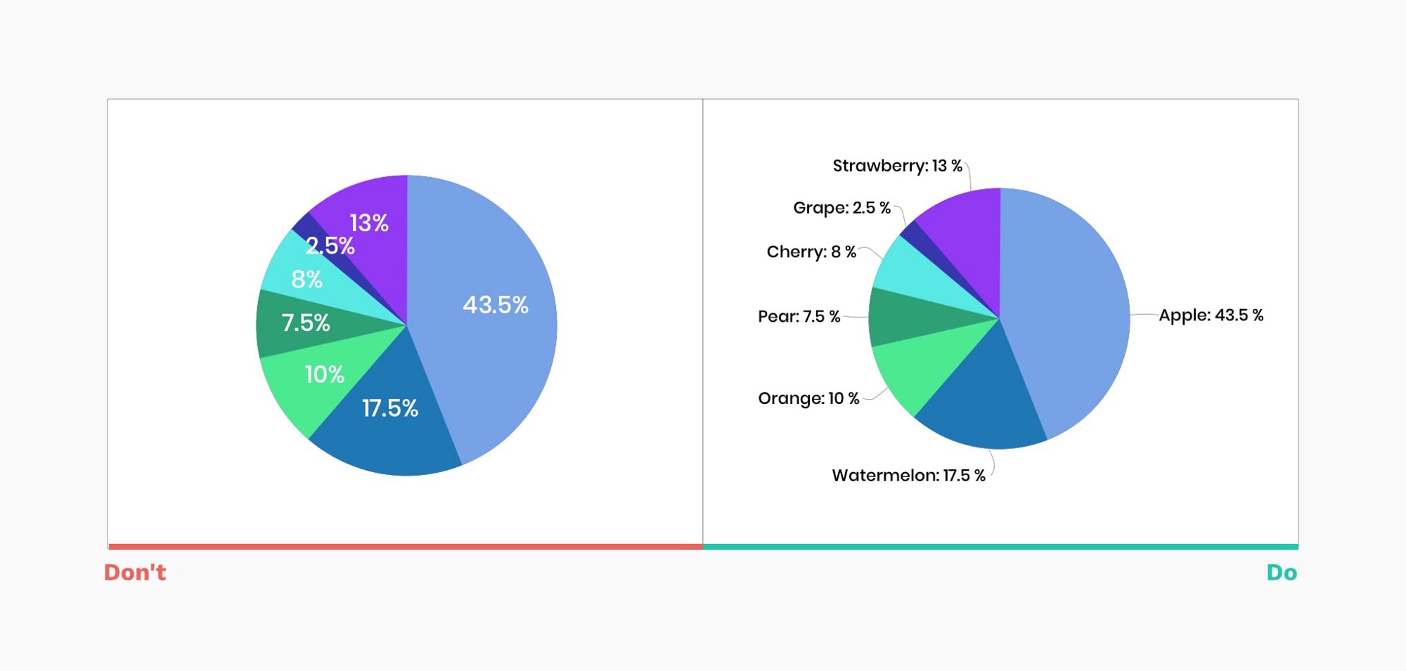
Putting the values on top of slices may cause multiple problems, from readability issues to challenges with thin slices. Instead, add black labels with clear links to each segment.
把数值放在图表分片上可能会引起多种问题,从可阅读性问题到非常小的分片上。相反,添加黑色标签,用清晰的线条分别连接各个标签。
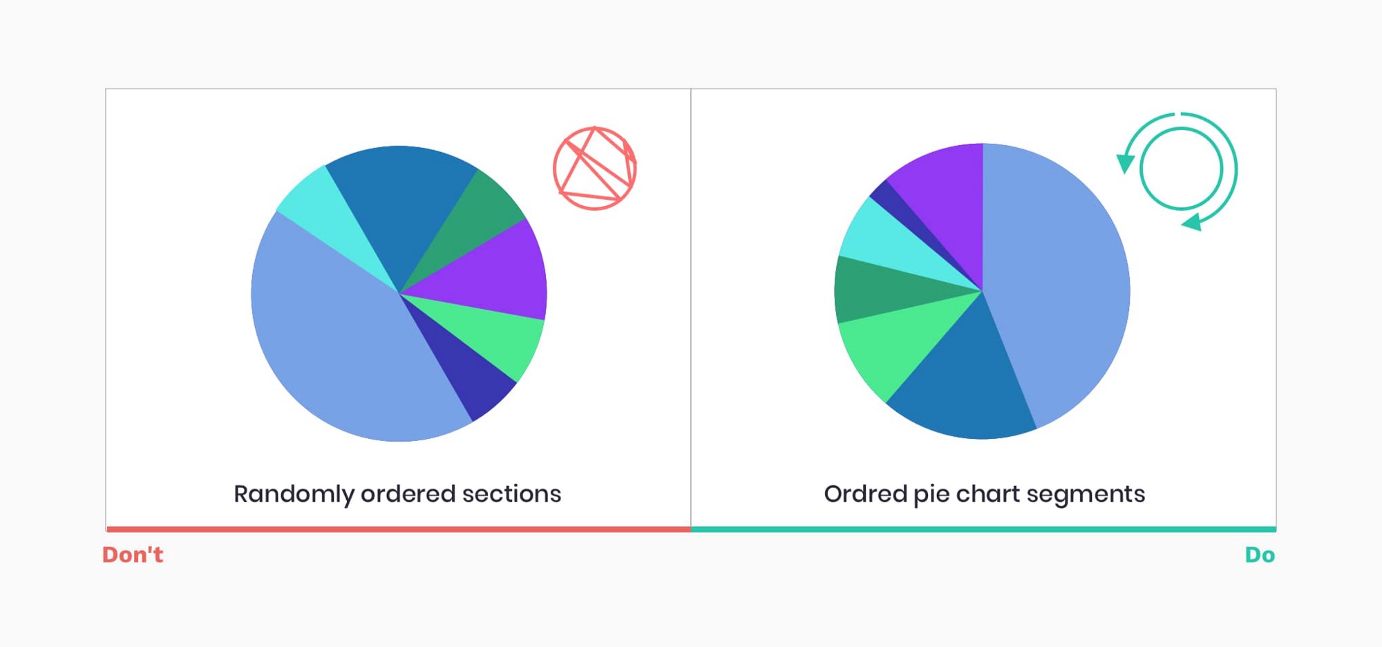
11. 设置饼图分片以加快扫描(Order pie slices for faster scanning)
There are several ways commonly accepted in ordering pie slices:
- Put the largest slice at 12 o’clock position and put next slices in descending order clockwise
- Put the largest slice at 12 o’clock, second largest after it clockwise, third at 11 o’clock, and all remaining slices in descending order clockwise
扇形图的排序有几种普遍被接受的方法:
- 将最大的分片安排在12点的位置,接下来的分片按顺时针方向依次递减。。
- 将最大的分片安排在12点的位置,第二大分片顺时针放在后面,第三片放在11点的位置,其余的分片都按顺时针的顺序递减。
12. 避免随机性(Avoid randomness)
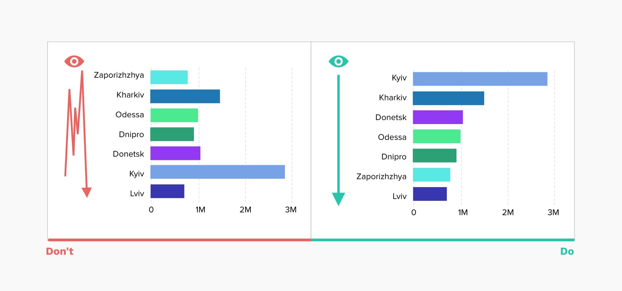
The same recommendation holds true for many other charts. Do not default to alphabetical sorting. Place the largest values on top (for horizontal bar charts) or left (for vertical bar charts) to ensure the most important values take the most prominent space, reducing the eye movements, and time required to read a chart.
同样的建议也适用于许多其他图表。不要默认为按字母顺序排序。把最大的数值放在上面(对于水平条形图)或左边(对于垂直条形图),以确保最重要的数值占据最突出的空间,减少眼睛的移动,以及阅读图表所需的时间。
13. 太纤细的甜甜圈图表无法阅读(Thin donut charts are impossible to read)
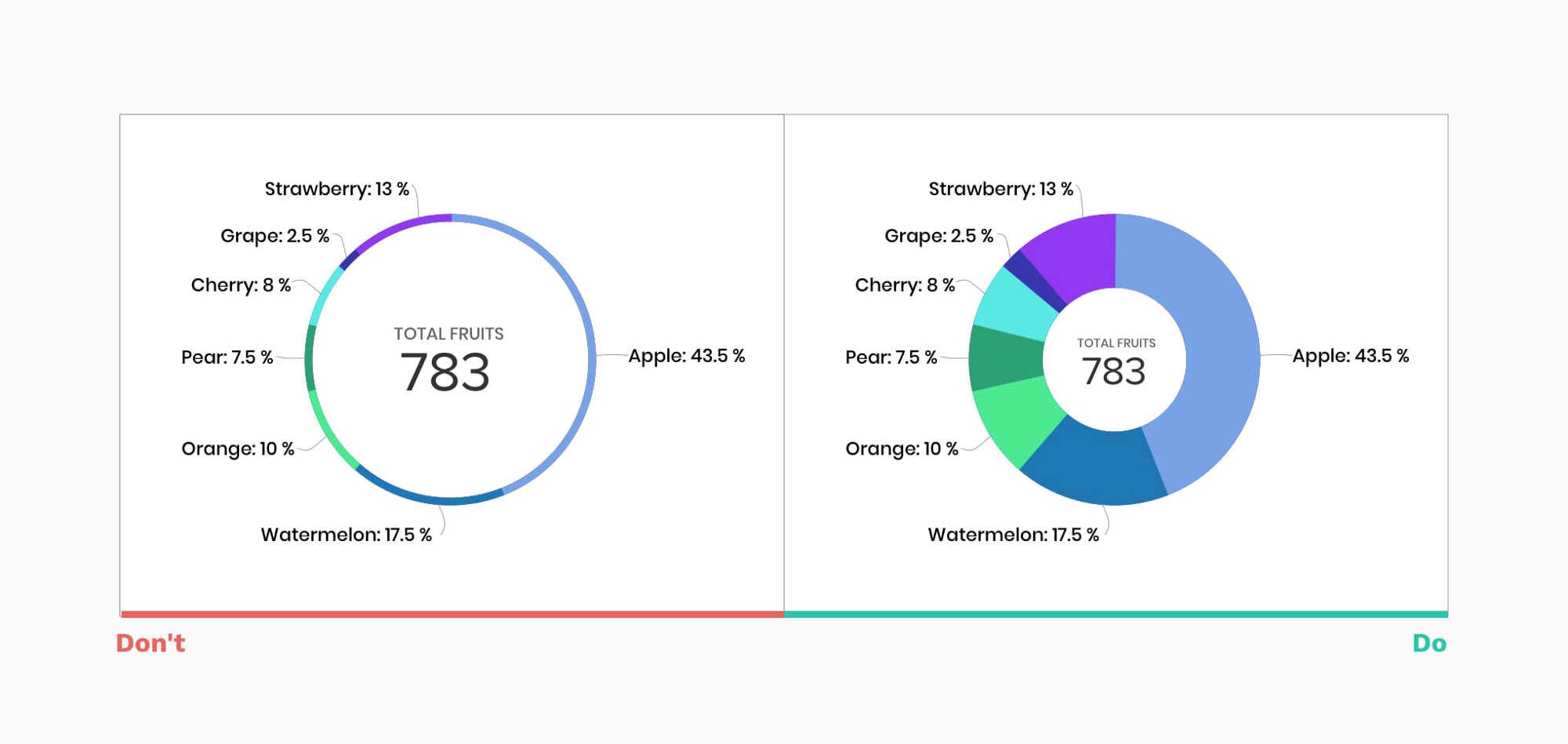
A pie chart in general is not the easiest chart to read, as it’s very hard to compare similar values. When we take the middle out and create a donut chart, we free as space to display additional information but sacrifice clarity, taken to extremes it renders the chart useless.
一般来说,饼状图不是最容易阅读的图表,因为很难比较类似的数值。当我们把中间的部分去掉,创建一个甜甜圈图时,我们腾出空间来显示额外的信息,但却牺牲了清晰度,走到极端时,就会使图表失去作用。
14. 让数据自己说话(Let data speak for itself)
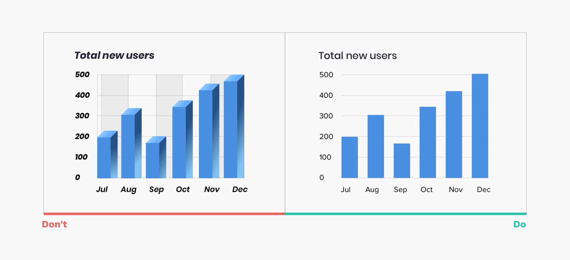
Unnecessary styling is not only distracting, it may cause misinterpretation of the data and users making false impressions. You should avoid:
- 3D elements, shading
- Shadows, gradients, and other color distortion
- Zebra patterns, excessive gridlines
- Highly decorative, italic, bold, or serif fonts
不必要的造型不仅令人分心,而且可能导致对数据的误解和用户的错误印象,你应该规避如下:
- 3D元素,阴影
- 阴影、渐变和其他颜色失真。
- 斑马纹,过多的网格线
- 过度的装饰性、斜体字、粗体字或衬线字体
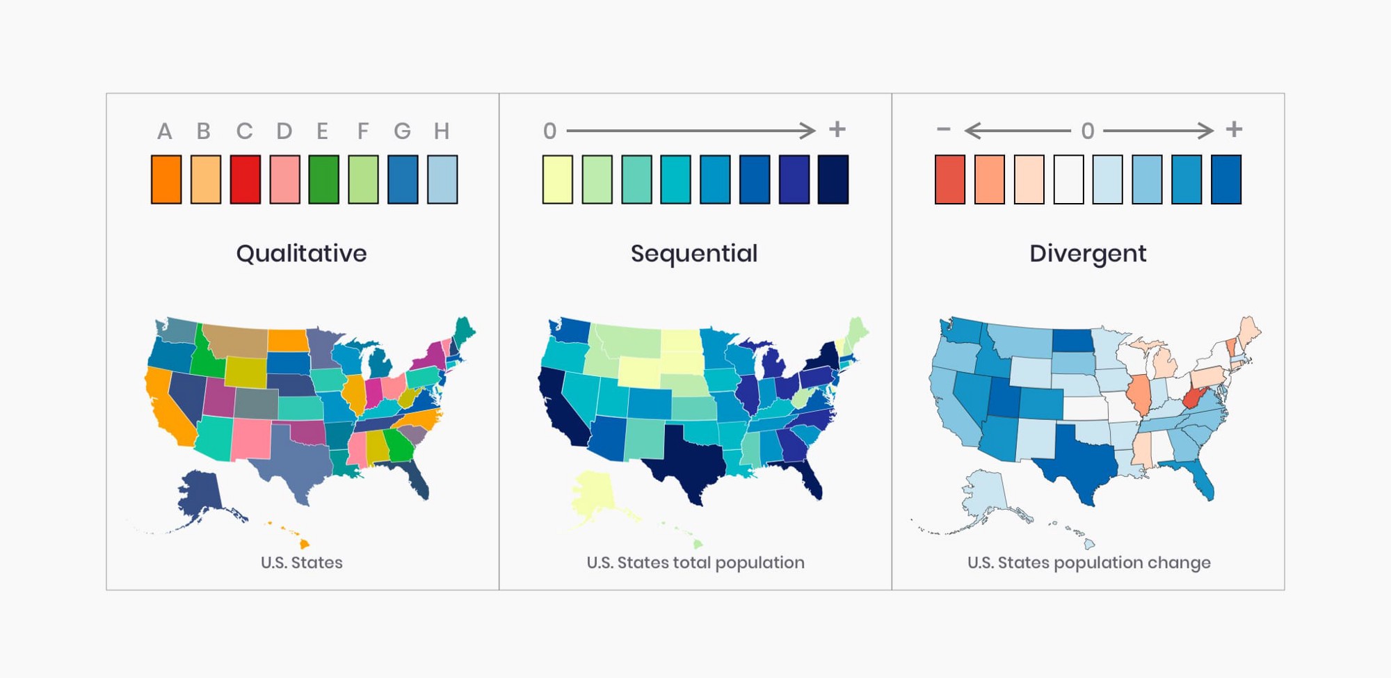
15. 选择一个与你的数据性质相匹配的颜色组(Pick a color palette that matches the nature of your data)
Color is an integral part of effective data visualization, consider those 3 color palette types when designing:
- A Qualitative color palette works best for the display of categorical variables. Colors assigned should be distinct to ensure accessibility.
- A Sequential color palette works best for numeric variables that need to be placed in a specific order. Using hue or lightness or a combination of both, you create a continuous color set.
- A Divergent color palette is a combination of two sequential palettes with a central value in the middle(usually zero). Often divergent color palettes will communicate positive and negative values. Make sure color also matches the notion of “negative” and “positive” performance.
颜色是有效的数据可视化不可或缺的部分,在设计时考虑这3种组色板类型:
- 定型色板最适合显示分类变量。指定的颜色应该独特的,以确保可及性。
- 连续性的色板对于不可计数变量,它需要按照特定的顺序去展示。按照色环或明度抑或两者一起使用,你创建了一组可延续使用的色板方案。
- 一个区分的颜色方案是包含了2组连续的色板和中间色(一般是0),通常区分的颜色方案将传达出正值和负值。以确保颜色匹配“正”和“负”的概念。
你可以看看这个工具- ColorBrewer 可以帮助你生成一个颜色集方案。
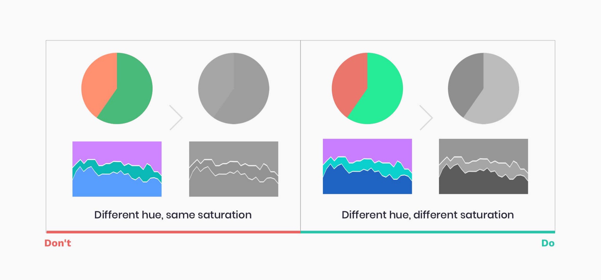
16.无障碍设计(Design for accessibility)
According to the National Eye Institute, about 1 in 12 humans are color blind. Your charts are only successful if they are accessible to a broad audience.
- Use different saturation and luminance in your color palette
- Print your data visualization in black and white to check the contrast and readability.
通过国际眼睛机构,大约12个人中就有1个人是色盲。如对更多更广的用户无障碍,那么你的图表就是成功的。
- 在你的颜色集中利用不同的饱和度和灰度。
- 将你的图表设计以黑白色打印,以确保它的对比度和可读性。
17.注重可读性(Focus on legibility)
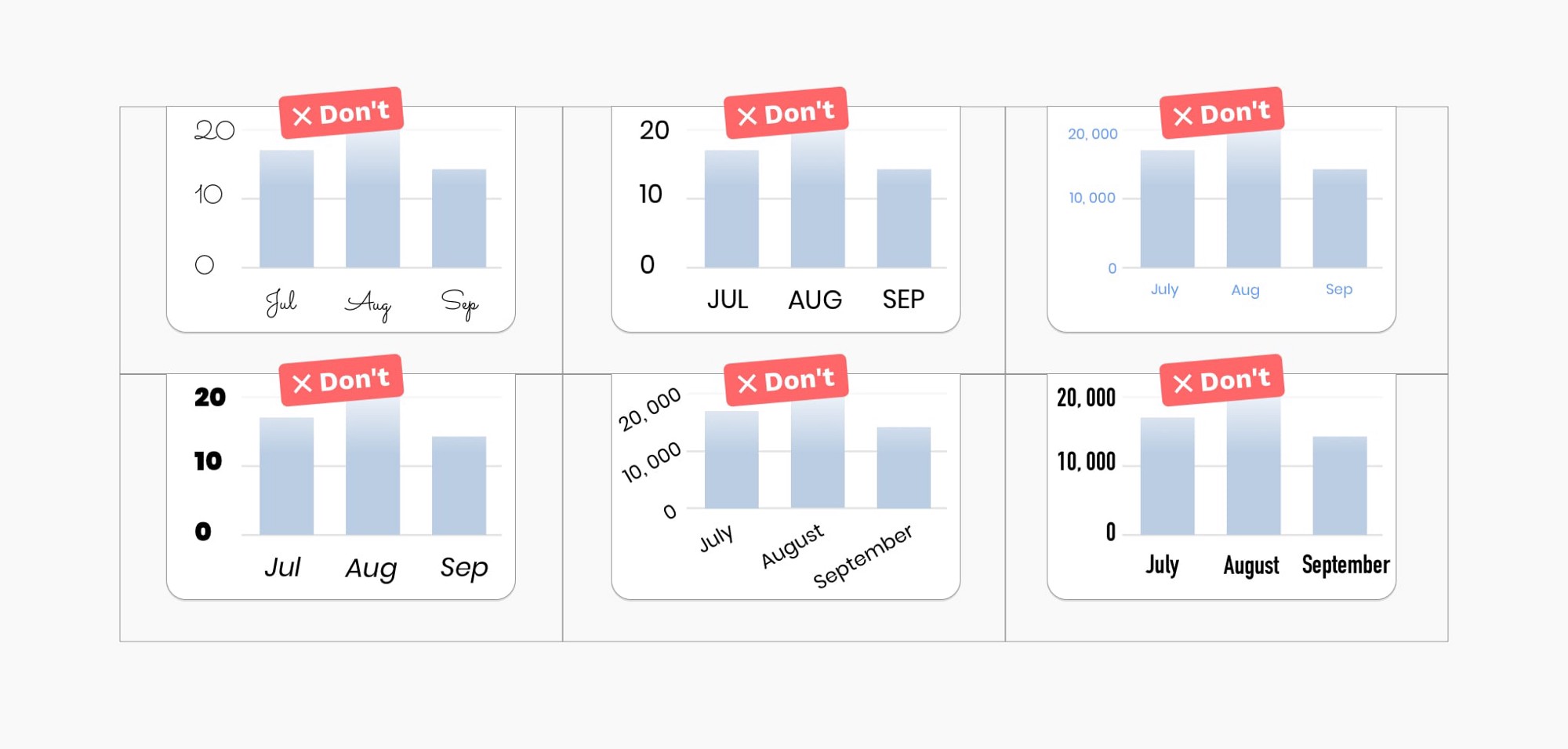
Make sure typography is communicating information and helping users focus on data, rather than distracting from it.
- Chose legible typefaces, avoid serif and highly decorative fonts
- Avoid italic, bold, and ALL CAPS
- Ensure high contrast with the background
- Do not rotate your text
确保排版是传达信息,帮助用户关注数据,而不是分散用户的注意力。
- 选择可读性强的字体,避开衬线字体和过度装饰的字体
- 避开斜体字、粗体字和大写字母
- 确保背景高对比度
- 不要翻转你的文字
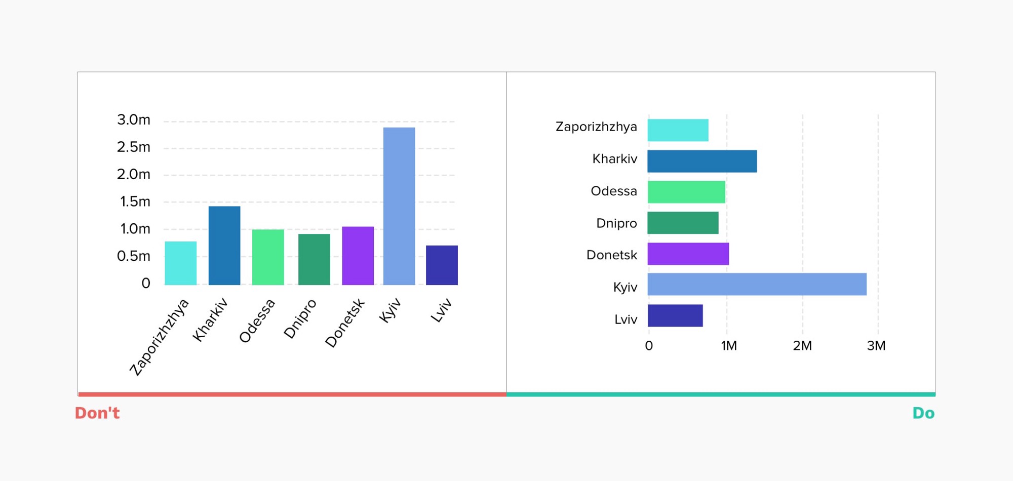
18. 使用条壮图而不是旋转标签(Use a horizontal bar chart instead of rotating labels)
This simple trick will ensure users will be able to scan the chart much more effectively, without straining their neck
这个简单的技巧将确保用户能够更有效地查阅图表,而不至于使他们的脖子感到疲劳
19. 选择你的图表库(Choose your charting library)
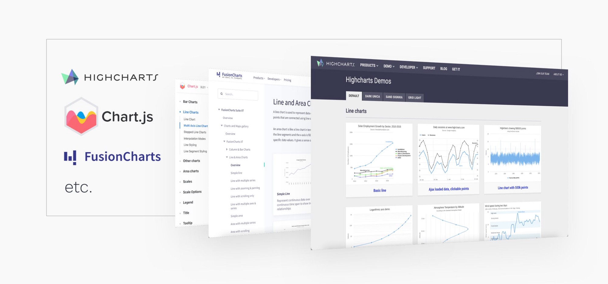
If your task is to add interactive charts to web and mobile projects, one of the first questions you should ask is what charting library will we use? Modern charting libraries have many of the previously mentioned interactions and rules baked in. Designing based on a defined library will ensure ease of implementation and will give you a ton of interaction ideas.
如果你的任务是在Web和移动端项目中添加交互式图表,你应该问的第一个问题是我们将使用什么图表库?现代的图表库有许多前面提到的互动和规则被植入其中。基于定义好的库进行设计,可以确保实施的便利性,并为你提供大量的交互想法。
20. 超越静态的报表(Go beyond static reports)
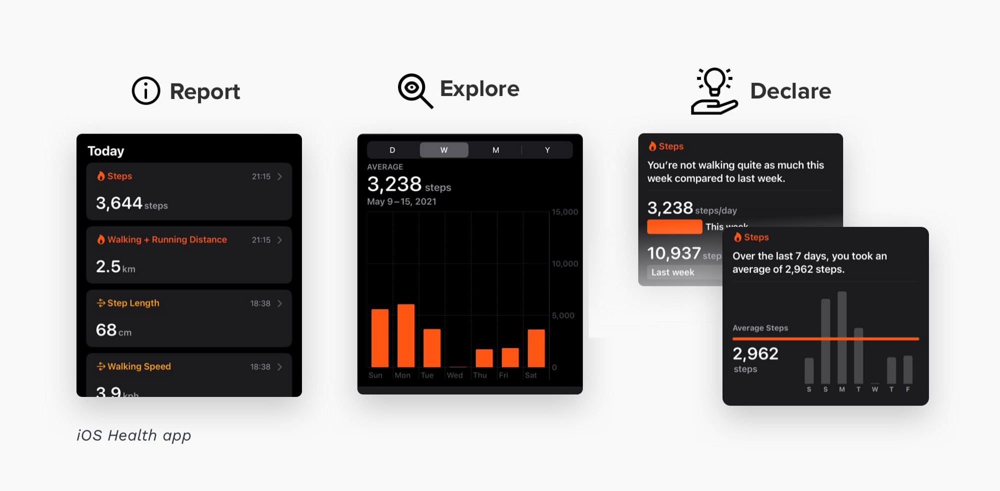
Help users explore by changing parameters, visualization type, timeline. Draw conclusions to maximize value and insight. In the example below, you can see the IOS Health app using a combination of various kinds of data presentation to its benefit.
通过改变参数、可视化类型、时间轴来帮助用户探索,得出结论,使价值和洞察力最大化。在下面的例子中,你可以看到IOS健康应用程序使用各种数据展示的组合,使其受益。
阅读建议(Reading suggestions)
For all who would like to learn more about this topic, I highly recommend reading “The Wall Street Journal Guide to Information Graphics: The Dos and Don’ts of Presenting Data, Facts, and Figures” by Dona M. Wong. Many of the ideas in this article are inspired by this book.
对于所有想了解这一主题的人来说,我强烈推荐阅读《华尔街日报信息图表指南-呈现数据、事实和数字的注意事项》,作者 Dona M. Wong。这篇文章中的许多想法都是受这本书的启发。
翻译:Cigar
原文链接:20 ideas for better data visualization | by Taras Bakusevych | Aug, 2021 | UX Collective (uxdesign.cc)
文章来源:Taras Bakusevych
